
thegoogler
New Member
- Joined
- Apr 15, 2021
- Messages
- 108
[Note: If someone out there has the same CATL 271Ah batteries and has either the actual manufacturer spec sheet or has their own real-world voltage tables for this model of cells, please let me know and I can make updates to anything in this post]
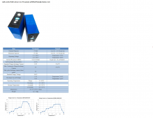
I recently purchased some 280Ah cells from the LiitoKala store. They sent me 271Ah CATL cells marked as model 6LH3L8 on the QR code. In an effort to configure these are closely as possible in my Simarine Pico battery monitoring system, as well as to figure out how to maintain these between 10-90% SoC with my solar charge controller as recommended, I spent some time digging for as much info as I could on the CATL 271Ah cells. From what I've found the following data seems to be the most accurate:

TBH finding specs on these has been more difficult than I expected, and on top of that even the basic specs like maximum charge and discharge temperature will vary between many of the vendors selling these (I've seen anywhere from 45C to 65C for both values). That said the chart above implies max charging temp of 60C and a realistic (useful) charging range of about 8C to 55C. I don't know if I trust that chart, but I did find the following doc below which looks like a legit spec which (may?) help confirm it.

On the state-of-charge front, one of the charts I found was published by Deligreen purports to show 0.2C charge and discharge voltages and the respective Ah rating (which does in fact go above 271). I use the term "purports" because I've not found this chart ANYWHERE else. Also because the spec sheet which had the graphs shows a different charging temp range than the above. That said the graph seems to better mimic what I've seen in terms of voltages upon initial receipt and top-balance, so I'm going to trust this is relatively accurate.

Given the above, I attempted to map that graph (which I also found in a larger and thus higher resolution format) to numerical values that I could use to actually program stuff (because nothing takes a PNG graph as input). Since the above graphs shows 0.2C charge and discharge rates, I decided I'd use the average of the two as a starting point for what the resting voltage should be. Is this correct? I don't really know, but my batteries arrived with 3.277V on them and took roughly 20 hours to get to the point where they shifted from CC to CV (roughly 90% charge). So if they arrived with 25% SoC and I pushed to 90% that's 65% charge of 271Ah or ~176Ah added. 20 hours @ 8.5Ah is 170Ah, so the math seems pretty close.

[FYI, I'm going to use the above values to configure my solar charge controller and battery SoC monitoring systems, but as I suspect my cells are not perfectly matched and quite likely are grade B stock I will update the above in the future as I have real-world performance data]
Graphing the above the resting state charge looks like this:

If you graph all 3 values (charging, resting, and discharging) this is how they appear to overlap:

The above graph is a bit quirky since my graphing all the data points the tails (100/99/95/90 and 10/5/0) show as the same width as the 10% increments in the middle. So because I'm OCD, I re-graphed the above but calculated the average points in between the known values. This makes each data point the same width, which better reflects how we human beings think of this kind of data:


I hope this data is helpful to other folks besides me.
I recently purchased some 280Ah cells from the LiitoKala store. They sent me 271Ah CATL cells marked as model 6LH3L8 on the QR code. In an effort to configure these are closely as possible in my Simarine Pico battery monitoring system, as well as to figure out how to maintain these between 10-90% SoC with my solar charge controller as recommended, I spent some time digging for as much info as I could on the CATL 271Ah cells. From what I've found the following data seems to be the most accurate:
TBH finding specs on these has been more difficult than I expected, and on top of that even the basic specs like maximum charge and discharge temperature will vary between many of the vendors selling these (I've seen anywhere from 45C to 65C for both values). That said the chart above implies max charging temp of 60C and a realistic (useful) charging range of about 8C to 55C. I don't know if I trust that chart, but I did find the following doc below which looks like a legit spec which (may?) help confirm it.
On the state-of-charge front, one of the charts I found was published by Deligreen purports to show 0.2C charge and discharge voltages and the respective Ah rating (which does in fact go above 271). I use the term "purports" because I've not found this chart ANYWHERE else. Also because the spec sheet which had the graphs shows a different charging temp range than the above. That said the graph seems to better mimic what I've seen in terms of voltages upon initial receipt and top-balance, so I'm going to trust this is relatively accurate.
Given the above, I attempted to map that graph (which I also found in a larger and thus higher resolution format) to numerical values that I could use to actually program stuff (because nothing takes a PNG graph as input). Since the above graphs shows 0.2C charge and discharge rates, I decided I'd use the average of the two as a starting point for what the resting voltage should be. Is this correct? I don't really know, but my batteries arrived with 3.277V on them and took roughly 20 hours to get to the point where they shifted from CC to CV (roughly 90% charge). So if they arrived with 25% SoC and I pushed to 90% that's 65% charge of 271Ah or ~176Ah added. 20 hours @ 8.5Ah is 170Ah, so the math seems pretty close.
[FYI, I'm going to use the above values to configure my solar charge controller and battery SoC monitoring systems, but as I suspect my cells are not perfectly matched and quite likely are grade B stock I will update the above in the future as I have real-world performance data]
Graphing the above the resting state charge looks like this:
If you graph all 3 values (charging, resting, and discharging) this is how they appear to overlap:
The above graph is a bit quirky since my graphing all the data points the tails (100/99/95/90 and 10/5/0) show as the same width as the 10% increments in the middle. So because I'm OCD, I re-graphed the above but calculated the average points in between the known values. This makes each data point the same width, which better reflects how we human beings think of this kind of data:
I hope this data is helpful to other folks besides me.